Sports logos represent more than just their team; they represent the fans, their community, and their city, and they have a way of bringing people together. In today’s world, there are few logos as prevalent and iconic as those found in sports and, as a graphic designer, I started to wonder “what makes a sports logo, specifically an NBA logo, great?” What started as a simple Google search turned into much more as I dug deeper, and I was able to find the key elements that make a great NBA logo. With that said, I present to you the Ultimate Ranking of NBA Logos.
Ultimate Ranking of NBA Logos
Research Background
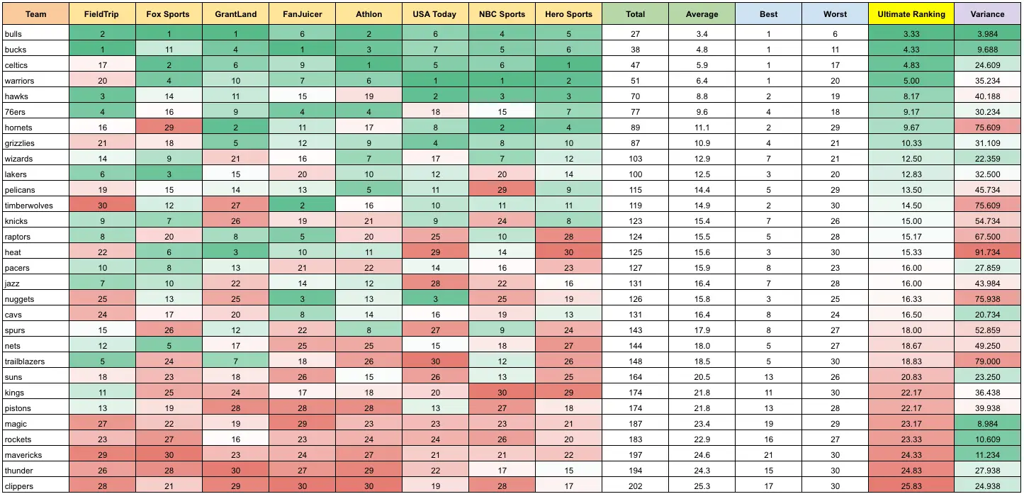
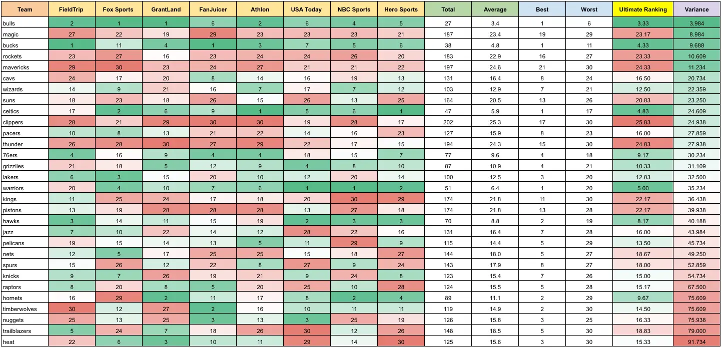
There were many steps that went into finding the ultimate NBA ranking. First, I found eight rankings of NBA logos from reputable sports and graphic design sites (listed at the bottom). From there, I created a spreadsheet of each team’s individual ranking from those sites, removed the best and worst rankings to eliminate any outliers, and averaged them out. With the final rankings, I was able to analyze the logos to find common threads between the best (and the worst).
I also calculated the variance, and something interesting stood out: not only were the Bulls and Bucks the two top-ranked teams, but they were also the teams with the lowest variance, meaning they were consistently ranked the top logo by all sources. On the flip side, the Mavericks, Rockets, and Magic, three of the five worst-ranked logos, were also consistently ranked as the least appealing.
Logo rankings sorted from 1-30Logos sorted by variance
It’s also important to note that the data represented in the article is based off of the logos from the 2017-2018 NBA season.
Key NBA logo characteristics
Distinctiveness
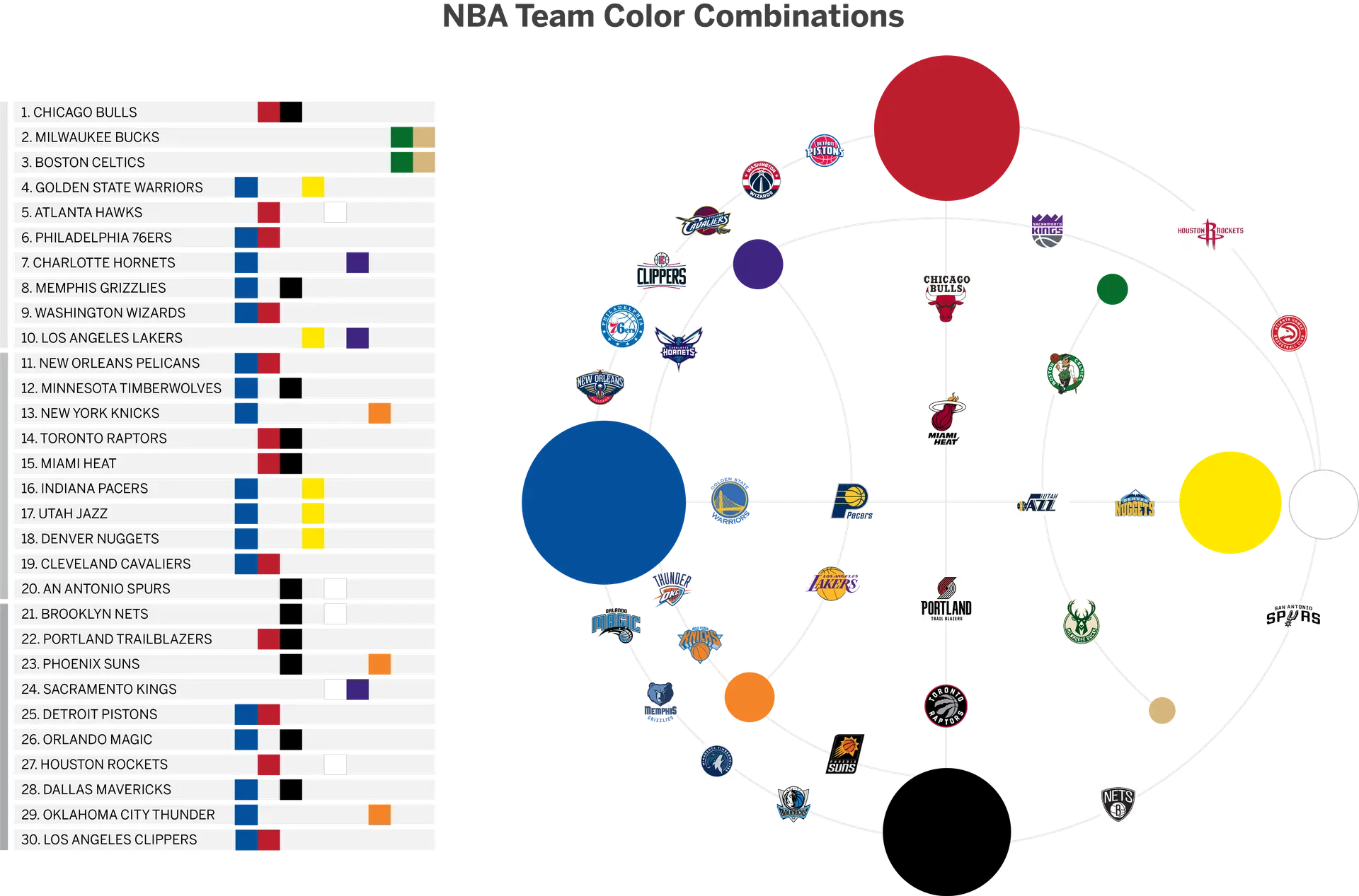
Colors, mascots, and iconic city elements – these are the key factors that truly differentiate NBA teams from each other in terms of branding and marketing. Logos are the cornerstone for each team, and each team has to be able to communicate these three elements using only their logo. The top ranked teams use this to their advantage, showcasing unique colors, mascots, and cities in a distinctive way.
The colors NBA teams use are a crucial way they differentiate themselves from the rest of the pack, however three main colors appear time and time again within the logos. For the main color in their logo, 57% of teams use blue, 40% use red, and 37% use black. By contrast, only 6% of NBA teams incorporate green into their main branding. These two teams that feature green in their logo are also the only ones to use tan as a main color. The Milwaukee Bucks and the Boston Celtics rank #2 and #3 in the top NBA logos. Could their distinctive, memorable color which helps them stand out from the crowd play a part in elevating them to the top positions in the rankings? Judging from the data, I certainly think so.
The distinctiveness of the city features and mascot the teams represent is also a highly important factor in a top ranked NBA logo. Having a memorable element in the name reiterated in the logo is absolutely critical in separating the bad logos from the outstanding ones. Compare the Charlotte Hornets’ logo to the LA Clippers’ logo. The Hornet’s logo is literally just a hornet, which makes the logo design easy to remember by relating the name to the image. The Clippers’ logo, by contrast, has no ties to “Clippers” – the sailing ships that passed through San Diego when the team was located there – and it doesn’t have any ties to Los Angeles. This makes it unmemorable, and lands it at the bottom of the rankings.
Composition
When looking at all 30 NBA teams together, there are several similar features that show up in a majority of the logos. One third of the NBA logos feature their team name wrapped in or around a circle. Now, to be clear, plenty have curved text, but the 9 logos I’ll be discussing are fully wrapped around or inside a circle. The data shows that in the top ranked 15 team logos, a whopping 60% have their names bound in or around a circle… and in the bottom 15 teams, 0% have their names in or around a circle. Is this the true tell for whether a team logo will be well received? The data points to “yes”.
With stats like this, we ask ourselves why having a team name wrapped in or around a circle would have the aesthetically pleasing effect it does. One theory is that manipulating the text like this incorporates the Gestalt principle of Proximity. Essentially, this means that the elements that make up the logo form a visually pleasing symmetrical, enclosed shape that we can easily digest, like the shape being a circle. On the other hand, in shapes like the Oklahoma City Thunder’s logo, the elements are too spread out and irregularly shaped for us to group them together in our mind and we perceive the logo as having many distinct elements rather than one complete, memorable shape.
Simplicity
One reason why the top teams are ranked the best may be because their logos are simple, and therefore more memorable and iconic than the others. When logos are simplified, they can more easily become ingrained in our minds. Color plays a big role in this. With the exception of the Boston Celtics, the top third of logos only utilize one or two colors. The middle teams primarily utilize three colors. This may be a key factor in separating the good logos from the best logos. The fewer colors are used, the easier it is for our brains to comprehend and remember the logo, sending them to the top of the list.
The worst ranked NBA Logos utilize anywhere from one to six colors in their logos, which tells us that the number of colors used isn’t a perfect representation of where the logo will fall on the list from best to worst. The bad logos are bad, regardless of the number of colors used.
Timelessness
When looking at past decades in which the current logos were first introduced, we see a trend that shows the teams whose current logos have been around the longest have a tendency to be more popular than teams whose logos are brand new. Of course, there are exceptions to this trend-and for good reason.
Teams like the Bulls and the Celtics whose logos have been hallmarks of the NBA since the 1950’s are understandably iconic, and this contributes greatly to their top rankings. Alongside these historic logos at the top of the list, however, lie logos like the Bucks’ and Wizards’ which have been introduced in this last decade and replaced outdated logos.
I believe that the longer a logo has been in use, the more popular it is with fans because these logos are the ones that remain ingrained in our mind, associated with the teams we love.
There are many elements that contribute to a NBA team’s logo ranking – their colors and mascots, the logo’s composition, any city elements, and the decade in which they were introduced. With all of these data sets, however, there is one absolutely key feature that dictates the ranking from best to worst that we haven’t looked at: intangible style and personal preference. The same applies to local business too! When the client’s personal preference is seamlessly married to a style that is both modern yet relatable, it can lead to better brand retention for the target audience. Which is why checking out companies like Timmermann Group and similar logo designers in STL, for getting that unique brand identity could prove extremely advantageous for fledgling small businesses in the U.S.
Anyways, about NBA, everyone has a favorite team whose logo will always rank first for them. I’d love to hear which team’s logo takes the number one spot in your book!
In the dynamic world of sports, technology is playing a pivotal role in transforming how businesses operate and how teams achieve peak performance. At the heart of this technological revolution are coaches’ apps, innovative tools that are redefining the landscape of sports management, training, and analysis. This blog post delves into the transformative impact of coaches’ apps on the sports industry, offering insights into their benefits, real-life applications, and the future of sports technology.
Whether you’re a sports business owner, manager, coach, or trainer, you know firsthand how administrative tasks pile up. Keeping operations running efficiently can be a struggle with all of the tasks that you juggle. Upper Hand is designed to help your business run more effectively and cater to your business needs. Here are some ways that Upper Hand can assist in making your sports business more efficient.