
Struggling to find the best sports facilities tools for your business? You’re not alone. Managing a sports facility in 2025 comes with unique challenges. Whether
Sports logos represent more than just their team; they represent the fans, their community, and their city, and they have a way of bringing people together. In today’s world, there are few logos as prevalent and iconic as those found in sports. But what makes a great sports logo…great?
To answer that question, we created an Ultimate Ranking of NFL Logos and performed an in-depth analysis of components like color occurrence frequency, use of mascots in logos, and even the number of colors used in each team’s emblem. From there, we saw similarities in the top and bottom ranking NFL team logos, and outlined exactly what makes a sports logo successful.
[su_spacer]
To determine the “ultimate ranking” of NFL logos, our team sourced rankings from 7 different reputable sports sites including FanJuicer, Athlon Sports, Bleacher Report, Sports Feel Good Stories, Sporty Tell, USA Today, and Thoughts from the Bench. We created a table listing each team’s spot in the 7 rankings, removed the best and worst rank scores to eliminate outliers, and averaged the scores out. These final averages determined each team’s place in the final ultimate NFL logo standings. Using these rankings, we were able to analyze the logos to find commonalities linking the top rated NFL logos (and the worst).
Additionally, we calculated the variance. Our findings were interesting – the team with the lowest variance was the Cleveland Browns, who placed at the bottom of the rankings. The team with the second lowest variance was the Houston Texans, who placed first in the rankings. This tells us that the teams with the best and worst NFL team logos were consistently best and worst across each of the 7 rankings
It’s important to note that we included the 1971-2020 version of the Washington Redskins logo in our ultimate ranking, as that was the version included in the aggregated ranking lists. Don’t miss our coverage of recent Sports Team Rebrandings: What Makes Them Winners or Losers (and Why).
To discern what role, if any, color had in determining where each team’s NFL logos ranked, we charted the frequency of color occurrences in the logos as well as the number of colors used in each logo. This allowed us to visualize both distinctiveness and simplicity of the emblems.
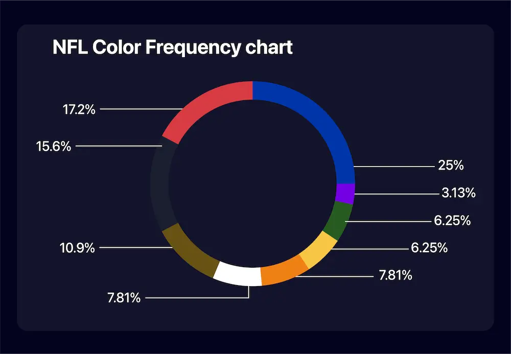
We determined color frequency by choosing the 2 colors most visible within each team’s logo. Color occurrence frequency is a great way to sort the highly distinct logos from those that are less distinct. Because a relatively large percentage of teams (42%) use either red or blue in their logos (and in fact, 15.6% of teams use both red AND blue) the teams whose logos feature distinct color schemes stand out, for better or worse.
For example, only 2 teams use purple as one of their signature colors. Can you think of which teams those are? (If you said the Ravens and the Vikings, you’re correct!)
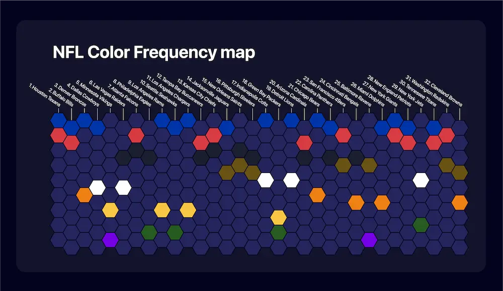
In charting the color occurrence frequency, we didn’t find any significant correlation between unique color schemes and placement on rankings, but there are a few interesting things to note.
As previously mentioned, we also charted the number of colors used in each logo to help determine their simplicity. One reason why the top teams are ranked the best may be because their logos are simple, and therefore more memorable and iconic than the others.
When logos are simplified, they can more easily become ingrained in our minds. Color plays a big role in this. The fewer colors are used, the easier it is for our brains to comprehend and remember the logo, sending them to the top of the list.
The top three highest ranked NFL team logos made use of three colors in their logo, and although there was fluctuation in the number of colors used towards the middle section, teams most frequently employed three hues.
However, the lowest ranked NFL Logos utilized anywhere from two to five colors in their logos, which tells us that the number of colors used isn’t a perfect representation of where the logo will fall on the list from best to worst. The bad logos are bad, regardless of the number of colors used.

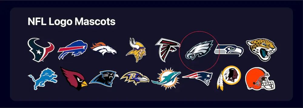
In charting the components that made up the NFL logos, the general subject matter fell into three categories: objects (the Dallas Cowboys’ star, the Indianapolis Colts’ horseshoe), mascots (Denver Broncos, Jacksonville Jaguars), or names/initials (Green Bay Packers’ “G”, New York Giants’ “NY”).
We set out to see if these elements were somehow significant in determining the teams’ positioning on the best to worst logo ranking scale.
NFL teams with objects as the main component of their logo had a tendency to fall in the middle of the pack, with outliers on either end, the Cowboys’ star placing high, and the Browns’ helmet placing low.

NFL teams with their name or letters in their logo had a tendency to place low on the ranking scale. 50% of teams in the bottom half of the ranking had their names/initials in their logo, while only 25% of teams in the top half of the ranking did so.


One incredibly interesting finding on the topic of mascots was that all but one faced in the right direction. Philadelphia’s eagle is the only mascot to face left. When we researched why this was the case, we found that the team and designers placed a hidden “E” for Eagles as an easter egg within the feathers of the bird.
So why do the other logos face right? To answer that, we turn to psychology.
Perceptual studies have found that people typically judge rightward objects as moving faster, and their movements to be more natural than the same objects going left. Additionally, our minds represent time as unfolding from left to right, so things facing right give the impression they’re moving into the future and making progress. We also have a better memory for rightward images. You can see why, then, designing logos this way creates the kind of impression teams would want fans to have about them.
There are countless elements that contribute to a NBA team’s logo ranking – their colors and key elements are just a few of them. With all of these data sets, however, there are two aspects that dictate the ranking from best to worst whose importance cannot be overstated: intangible style and personal preference.
Do you have a favorite sports logo from a design standpoint? If you’re interested in learning how to make your own logo, check out our article on how to create a sports and fitness logo!
If you enjoyed this article, don’t miss our analysis of NBA team logos, and our article detailing the wildly surprising relationship between NBA logo rankings and their placement in the NBA playoffs!

Struggling to find the best sports facilities tools for your business? You’re not alone. Managing a sports facility in 2025 comes with unique challenges. Whether

Find your profitable niche in the competitive youth sports market. Learn 10 strategies to identify, implement, and excel in your niche.